
KE BOOK DESIGN

Recently I had the opportunity of working with a brand new client. Not only were they a new client for me but a new client to the world. This year, The House Studio, was born where else but in an old house in Midtown, Kansas City. The House studio proclaims themselves to be a publishing studio focused on producing a new generation of resources--authentic, relevant, and life-changing.
After working with them on their branding and identity (seen here) I had the opportunity to work on their first product, The Kingdom Experiment. 
The Kingdom Experiment: A Community Practice on Intentional Living is a book about living a life that is contradictory to everything we have known before. The theme of the book comes from the Sermon on the Mount which flips everything we thought we knew upside down. So living what seems forward is backwards and what is backwards is forward.
As I worked on the cover, the desire was to create something that showed this "upside/backwards" theme in a way that made the book cover itself backwards. After sharing the concept with the awesome people at the House Studio they liked the idea of the front cover and back cover being reversed but weren't overly thrilled with the initial design comps. I did several more comps and they ended up choosing this one which is an altered retro/modern version of an earlier comp that they initially liked more than I did (this version is much better).
This cover design is made up of 8 circles to symbolize the 8 chapters that will ideally (but not necessarily) be read together and lived out in a book group or community; an experiment of sort. The front and back cover was kept minimal with only the title, subtitle and authors on the back and only the bar code on the front to give it its "contradictory to everything we have known before about large title on the front" feel. The spine only has "KE" and the publisher logo.
After the cover was approved, the House Studio asked if I would design the interior. "Well," I said, "I have never done an interior but I can give it a shot." They sent me the manuscript and off to work I went. Below are a few samples of the inside pages. My first interior typesetting since the design school days. The interior is one color with full bleed which includes some illustration and photography.


To see more photographs of the cover and inside pages, view my flickr set.
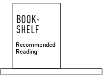
The top image is part of a poster that I designed as part of an advertising campaign for the book.
The book is available on Amazon
![]()


Thanks for the plug!
ReplyDelete