8.25.2009

(RE)DESIGNING HEALTH CARE


Almost everything gets designed and then redesigned in its lifetime. Our living spaces get redesigned. The products we buy and the packages they come in get redesigned. Cars get redesigned on a yearly basis. iPods typically get redesigned right before Christmas. I have even redesigned a book or two.

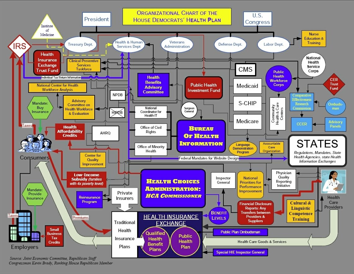
For more than a generation, there has been a desire by many to redesign health care yet it still looks like it did in the 1930s. Not much has stayed the same over our lifetime like health care has except for a few logos like Coca-Cola but even that has been tweaked. Now, more than ever, it looks as though this might all change. One of the biggest social redesigns of our life time might be right around the corner. Will it work? What will it look like? None of us, not even the politicians, know yet.

Before starting any design or a redesign there must be a market understanding and background research. This is where we are at.

What will work and what won't? President Obama thinks he knows. But wait. Others have had ideas also.

What are others doing? The below video from Frontline investigates what other "rich" countries have done and are doing with their health care.

Will we see something similar to these other countries? The fact, with insurance becoming harder to get especially for the unemployed, is that there must be a redesign in health care. However, as most town hall meetings show, "design by committee" will not work. Or will it?

Check out this investigation.


Another interesting site about those that have suffered because of this country’s health care system.

Bookmark and Share

8.19.2009

PICADOR FALL 2009


If you are anything like me and like paperbacks then you probably will love Picador, if you don't already. Yesterday, Picador Paperbacks posted their Fall 2009 catalog on their Facebook page as cover images. A beautiful collection when presented in album form. A few good ones to add to the book collection if for nothing more than the design.

Below, for your inspiration, are some beautiful covers I liked.


Design by Kelly Blair


Design by Alex Camlin


Design by Henry Sene Yee Photography by Jon Shireman


Design by Susan Mitchell


Design by Rob Grom


Design by Kevin Brainard Illustrated by Paulina Reyes

Since its launch in 1995 Picador has rapidly established itself as one of the leading literary trade paperback imprints in the country.

At this point, the designers are unknown and some covers come from the hardback editions. Let me know if you know who designed the above covers.

Bookmark and Share

8.14.2009

QUOTE

8.12.2009

REEL DESIGN FILM SERIES


AIGA Kansas City has announced three new documentaries as part of the REEL DESIGN Film Series. The films will be showing at the Tivoli Theater 4050 Pennsylvania Ave Kansas City, MO 64111 and will have limited seating so be sure to get tickets.

Milton Glaser: To Inform & Delight
Tuesday, August 25, 2009
7:30 PM - 9:30 PM
Tickets:
$10 general admission online
$12 at the door

View Trailer

Objectified
Tuesday, September 15, 2009
7:30 PM - 9:30 PM
View Trailer

Rem Koolhaus: A Kind of Architect
Tuesday, September 29, 2009
7:30 PM - 9:30 PM
View Trailer

For more info and to register for tickets visit AIGA KC.

Bookmark and Share

KE BOOK DESIGN


Recently I had the opportunity of working with a brand new client. Not only were they a new client for me but a new client to the world. This year, The House Studio, was born where else but in an old house in Midtown, Kansas City. The House studio proclaims themselves to be a publishing studio focused on producing a new generation of resources--authentic, relevant, and life-changing.

After working with them on their branding and identity (seen here) I had the opportunity to work on their first product, The Kingdom Experiment.


The Kingdom Experiment: A Community Practice on Intentional Living
is a book about living a life that is contradictory to everything we have known before. The theme of the book comes from the Sermon on the Mount which flips everything we thought we knew upside down. So living what seems forward is backwards and what is backwards is forward.

As I worked on the cover, the desire was to create something that showed this "upside/backwards" theme in a way that made the book cover itself backwards. After sharing the concept with the awesome people at the House Studio they liked the idea of the front cover and back cover being reversed but weren't overly thrilled with the initial design comps. I did several more comps and they ended up choosing this one which is an altered retro/modern version of an earlier comp that they initially liked more than I did (this version is much better).

This cover design is made up of 8 circles to symbolize the 8 chapters that will ideally (but not necessarily) be read together and lived out in a book group or community; an experiment of sort. The front and back cover was kept minimal with only the title, subtitle and authors on the back and only the bar code on the front to give it its "contradictory to everything we have known before about large title on the front" feel. The spine only has "KE" and the publisher logo.


After the cover was approved, the House Studio asked if I would design the interior. "Well," I said, "I have never done an interior but I can give it a shot." They sent me the manuscript and off to work I went. Below are a few samples of the inside pages. My first interior typesetting since the design school days. The interior is one color with full bleed which includes some illustration and photography.


To see more photographs of the cover and inside pages, view my flickr set.

The top image is part of a poster that I designed as part of an advertising campaign for the book.

The book is available on Amazon

Bookmark and Share

8.11.2009

QUOTE

8.09.2009

ARTHUR'S DESIGN


Arthur's Design is a design blog. A place to explore and share design its process and inspiring things related to it. Here you will find posts about design, photography, books, bikes, quotes, video, and other random inspiration.

DESIGN BY AAD
Design By AAD is the design studio of Arthur Cherry located in Kansas City, Missouri. AAD specializes in book jacket & cover design, but also creates brand identity, plays with type, takes photos and works on projects print or digital.

ARTHUR
Arthur is an art director and designer who has received recognition in Print Magazine's Regional Design Annual, been awarded AIGA design awards, been featured in GOOD magazine, INK magazine and on various design websites. He also speaks about design and has been a judge for AIGA's 50 books / 50 Covers competition.

When not working Arthur can be found riding one of his bikes, taking photos or traveling.

GET IN TOUCH
Send us an email for art direction, consultation or design work inquires or to just say hello.

Email
Twitter
Facebook

Related Posts with Thumbnails